210323 CSS 盒子模型 字体图标 定位
16lz
2021-03-25
盒子模型
在CSS中,HTML元素相当于一个个盒子。
块级盒子:
- 换行
- 占用容器全部宽度(flow从上到下)
- 有width, height
行内盒子:
- 只占用满足内容需要的宽度(flow从左到右)
- 忽略width, height
- 不能包含块级元素作为子元素
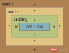
盒子宽度和高度计算
盒子宽度 = 内容区width + (2 x padding) + (2 x border)
盒子高度 = 内容区height + (2 x padding) + (2 x border)
单位
- px: 绝对单位,固定大小
- em:相对单位,相对于父节点字体大小
- rem: 相对单位,相对于根节点html字体大小
- %:相对单位,相对于父节点大小
页面初始化:
* {margin: 0;padding: 0;box-sizing: border-box;/*盒子大小按宽高设定固定,内容区会缩小*/}html {font-size: 10px;/* 易于计算 */}
转为标准盒子-内容区作为宽高计算标准
box-sizing: content-box;background-clip: content-box;
视口
视口 viewport
可视窗口,手机端显示PC页面默认980px
单位
vh(view-height):1vh = 视口高度的1/100
vw(view-width): 1vw = 视口宽度的1/100
margin-left: auto; 尽可能增加左侧空间,向右
margin-right: auto; 尽可能增加右侧空间,向左
.box {width: 50vw;height: 50vh;margin: 10px auto;border: 2px solid;color: black;background-color: lightblue;padding: 5px 10px;font-size: 30px;}
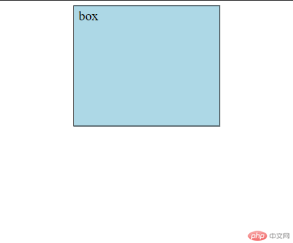
这个盒子始终占据视口宽度的一半,高度的一半
字体图标
引入方式
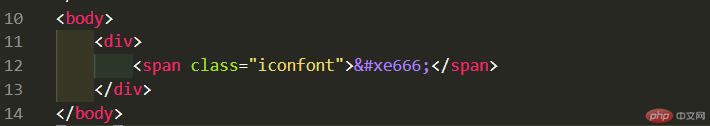
1 . Unicode
兼容性好
- 下载字体图标文件夹放入项目目录
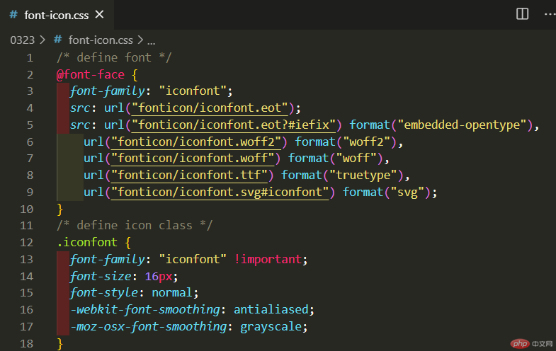
- 新建.css文件,定义字体,类
- 在HTML页面中引入.css文件

- 在元素中使用图标的对应编码
效果
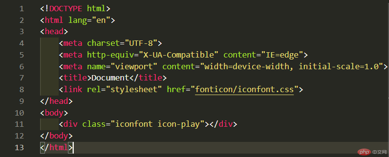
2 . Font class
方便
第一步:引入项目下面生成的 fontclass 代码:<link rel="stylesheet" href="./iconfont.css">
第二步:挑选相应图标并获取类名,应用于页面:<span class="iconfont icon-xxx"></span>
例:
图标:
定位
规则:
position: value;
- static:默认,即无定位
- relative:相对于在文档流中的原始位置,转为定位元素
- absolute:绝对,脱离文档流,相对于在文档流中的原始位置(若无父元素即相对于浏览器窗口),转为定位元素
- fixed:固定位置,相对于浏览器窗口,不受滚动影响
定位元素可以设置偏移量
文档流:显示顺序于书写顺序一致
top
right
left
bottom
例:
原始位置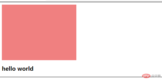
设为position: static;
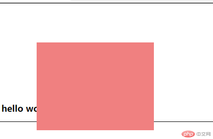
设为position: relative;
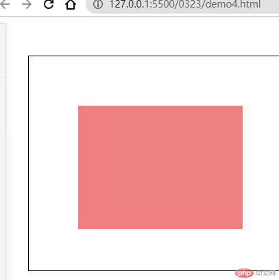
.box {width: 20em;height: 15em;background-color: lightcoral;position: relative;top: 6em;left: 6em;}
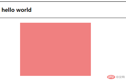
设为position: absolute;
.box {width: 20em;height: 15em;background-color: lightcoral;position: absolute;top: 6em;left: 6em;}
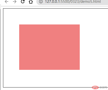
设为position: fixed;
绝对定位应用
absolute 与父级定位元素
若父级非定位元素:
<head><style>.box {width: 20em;height: 15em;background-color: lightcoral;position: absolute;top: 6em;left: 6em;}.parent {border: 1px solid black;height: 26em;/* top: 4em;left: 4em; */}</style></head><body><div class="parent"><div class="box"></div></div><!-- <h2>hello world</h2> --></body>
若父级为定位元素relative:
<style>.box {width: 20em;height: 15em;background-color: lightcoral;position: absolute;top: 6em;left: 6em;}.parent {border: 1px solid black;height: 26em;position: relative;top: 4em;left: 4em;}</style>
居中
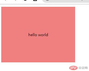
行内元素居中
设置行高为容器高度即可
<style>.box {width: 20em;height: 15em;background-color: lightcoral;text-align: center;line-height: 15em;}</style>
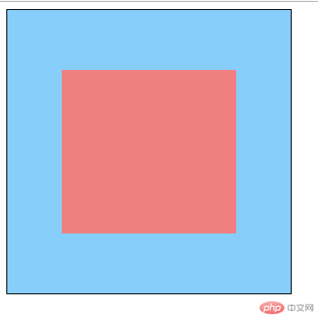
块元素居中
注:设置 margin:auto 只能水平居中,因为垂直方向没有限制,水平方向有限制
<style>.box {width: 16em;height: 15em;background-color: lightcoral;text-align: center;line-height: 15em;position: absolute;top: 0;bottom: 0;left: 0;right: 0;margin: auto;}.parent {border: 1px solid;background-color: lightskyblue;width: 26em;height: 26em;position: relative;}</style>
<div class="parent"><div class="box"></div></div>
更多相关文章
- 【CSS入门】理解css中min-width和max-width,width与它们之间的区
- 【css入门】css盒模型及css定位的常用属性详解
- box-sizing
- 盒模型和定位
- 0323作业-CSS盒模型、CSS相对定位和绝对定位及块元素垂直居中
- 演示box-sizing功能并实例/演示相对定位与绝对定位的区别与联系
- css之盒模型与定位
- 【CSS入门】CCS基本语法和常用选择器的使用方法
- box-sizing功能,相对定位/绝对定位