【案例】使用flex弹性布局仿写移动端苏宁首页并了解grid布局的相关属性
16lz
2021-03-27
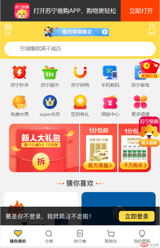
利用flex布局进行仿写移动端苏宁易购首页
- 完善移动端京东首页 http://easys.ltd/jd/
- 仿写移动端苏宁首页 http://easys.ltd/sn
首页代码
index.html
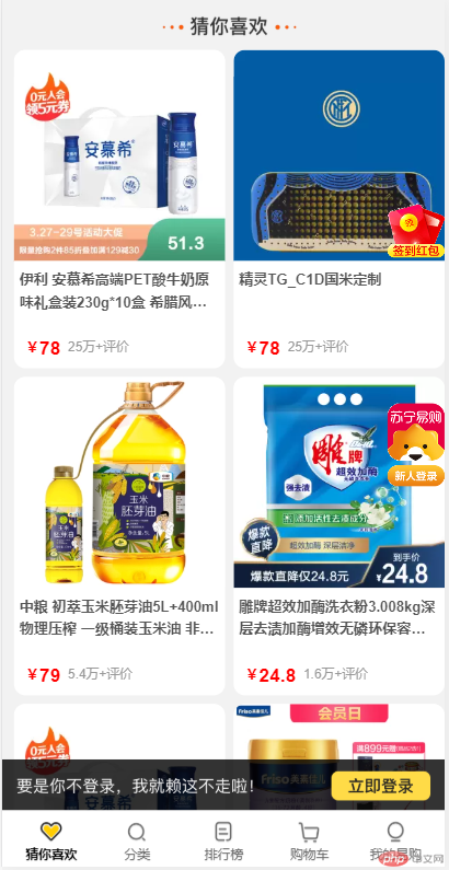
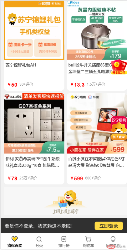
<!DOCTYPE html><html lang="en"><head><meta charset="UTF-8"><meta name="viewport" content="width=device-width, initial-scale=1.0"><title>苏宁易购首页</title><link rel="stylesheet" href="css/index.css"></head><body><!-- 下载提示 --><div class="headDown"><a href="https://c.m.suning.com/channelwap.htm?appid=1&packnversion=337&channelcode=40156&wap_source=%E6%98%93%E8%B4%AD%E7%AB%99%E5%86%85wap%E9%A6%96%E9%A1%B5%E9%A1%B6%E9%83%A8%E4%B8%8B%E8%BD%BD%E5%A4%B4&wap_medium=40156&wap_content=&wap_term=&wap_campaign=&downflag=0&adTypeCode=1002&adId=https%3A%2F%2Fm.suning.com%2F"><span></span><img src="https://image.suning.cn/uimg/cms/img/161275688582112536.jpg" alt=""></a></div><!-- 头部菜单 --><div class="sn-nav"><div class="nav-bg"><img src="https://image1.suning.cn/uimg/cms/img/161243730178975729.png"></div><div class="top-type"><div class="content-wrap-one"><a href=""><img src="https://image2.suning.cn/uimg/cms/img/157199320847433454.png" alt=""></a><a href=""><img src="https://image2.suning.cn/uimg/cms/img/161675232602234223.gif" alt=""></a><a href=""><img src="https://image2.suning.cn/uimg/cms/img/157199321817918653.png" alt=""></a></div><div class="content-wrap-two"><form action=""><span class="iconfont "></span><input class="searchInput" name="index_none_header_sysc" type="text" placeholder="空调爆款满千减百" autocomplete="off"></form></div></div></div><!-- 主体区域 --><div class="main"><!-- 主导航区 --><div class="enter-list"><ul class="fix"><li><a href="#"><img src="https://image2.suning.cn/uimg/cms/img/161294178174781132.png?from=mobile" alt=""><span>苏宁秒杀</span></a></li><li><a href="#"><img src="https://image1.suning.cn/uimg/cms/img/161293951076282456.png?from=mobile" alt=""><span>苏宁超市</span></a></li><li><a href="#"><img src="https://image1.suning.cn/uimg/cms/img/161294179334814175.png?from=mobile" alt=""><span>苏宁拼购</span></a></li><li><a href="#"><img src="https://image2.suning.cn/uimg/cms/img/161293957567317395.png?from=mobile" alt=""><span>手机数码</span></a></li><li><a href="#"><img src="https://image3.suning.cn/uimg/cms/img/161293958842515136.png?from=mobile" alt=""><span>苏宁家电</span></a></li><li><a href="#"><img src="https://image1.suning.cn/uimg/cms/img/161293959950045622.png?from=mobile" alt=""><span>免费水果</span></a></li><li><a href="#"><img src="https://image2.suning.cn/uimg/cms/img/161293961484173843.png?from=mobile" alt=""><span>super会员</span></a></li><li><a href="#"><img src="https://image1.suning.cn/uimg/cms/img/161293963977525820.png?from=mobile" alt=""><span>签到有礼</span></a></li><li><a href="#"><img src="https://image2.suning.cn/uimg/cms/img/161293965567020138.png?from=mobile" alt=""><span>领券中心</span></a></li><li><a href="#"><img src="https://image2.suning.cn/uimg/cms/img/161293968063152286.png?from=mobile" alt=""><span>更多频道</span></a></li></ul></div><!-- 新人礼包 --><div class="newImgFloor-content"><a href="https://newmem.suning.com/newmem-web/nm/PAGE518604586267131904.htm"><img src="https://image1.suning.cn/uimg/cms/img/160415964665844208.png"></a><a href="https://newmem.suning.com/newmem-web/nm/PAGE518604586267131904.htm"><img src="https://image3.suning.cn/uimg/cms/img/160415965447533335.gif"></a><a href="https://newmem.suning.com/newmem-web/nm/PAGE518604586267131904.htm"><img src="https://image1.suning.cn/uimg/cms/img/160415966314573447.gif"></a></div><!-- 商品列表 --><div class="guessUlike"><a class="title" href="https://c.m.suning.com/phbIndex3.html"><img src="https://image3.suning.cn/uimg/cms/img/157793128909842388.png?format=_is_1242w_100h.webp"></a><ul><li class="item"><a href=""><img src="https://imgservice.suning.cn/uimg1/b2c/atmosphere/7rUkk6cK3SCZdMISYTbPSQ.png?format=_is_300w_300h_4e.webp" alt=""><p>伊利 安慕希高端PET酸牛奶原味礼盒装230g*10盒 希腊风味营养学生成人早餐奶酸奶</p><div class="price"><span class="flag">¥</span><span class="pre-price">78</span><span class="price-comments">25万+评价</span></div></a></li><li class="item"><a href=""><img src="https://imgservice.suning.cn/uimg1/b2c/image/onlVKphMGZSM57CgxO53yg.png?format=_is_300w_300h_4e.webp" alt=""><p>精灵TG_C1D国米定制</p><div class="price"><span class="flag">¥</span><span class="pre-price">78</span><span class="price-comments">25万+评价</span></div></a></li><li class="item"><a href=""><img src="https://imgservice.suning.cn/uimg1/b2c/image/WHVdqX-XWOrflA07JiOoIw.jpg?format=_is_300w_300h_4e.webp" alt=""><p>中粮 初萃玉米胚芽油5L+400ml 物理压榨 一级桶装玉米油 非转基因 食用油粮油</p><div class="price"><span class="flag">¥</span><span class="pre-price">79</span><span class="price-comments">5.4万+评价</span></div></a></li><li class="item"><a href=""><img src="https://imgservice.suning.cn/uimg1/b2c/atmosphere/rPmiXMbXtGFr2p4fDG2LcQ.png?format=_is_300w_300h_4e.webp" alt=""><p>雕牌超效加酶洗衣粉3.008kg深层去渍加酶增效无磷环保容量更多生活更美</p><div class="price"><span class="flag">¥</span><span class="pre-price">24.8</span><span class="price-comments">1.6万+评价</span></div></a></li><li class="item"><a href=""><img src="https://imgservice.suning.cn/uimg1/b2c/atmosphere/7rUkk6cK3SCZdMISYTbPSQ.png?format=_is_300w_300h_4e.webp" alt=""><p>伊利 安慕希高端PET酸牛奶原味礼盒装230g*10盒 希腊风味营养学生成人早餐奶酸奶</p><div class="price"><span class="flag">¥</span><span class="pre-price">78</span><span class="price-comments">25万+评价</span></div></a></li><li class="item"><a href=""><img src="https://imgservice.suning.cn/uimg1/b2c/image/_Ob1Ce4BkgbQ7Q-sG1sVXQ.jpg?format=_is_300w_300h_4e.webp" alt=""><p>美素佳儿(Friso)儿童配方牛奶粉 4段(3-6岁适用)900克罐装(荷兰原装进口)</p><div class="price"><span class="flag">¥</span><span class="pre-price">199</span><span class="price-comments">12万+评价</span></div></a></li><li class="item"><a href=""><img src="https://imgservice.suning.cn/uimg1/b2c/image/UuBgXj2X962T1FOLWT8rnA.jpg?format=_is_300w_300h_4e.webp" alt=""><p>苏宁锦鲤礼包AH</p><div class="price"><span class="flag">¥</span><span class="pre-price">50</span><span class="price-comments">30+评价</span></div></a></li><li class="item"><a href=""><img src="https://uimgproxy.suning.cn/uimg1/pcpv/pcpv/2021/03/27/11/iwoghBannerPicture/YE9dl7Vfhi1616815773607.png?format=_is_300w_300h_4e.webp" alt=""><p>bull公牛开关插座86型G07香槟金墙壁二三插五孔电源插座面板带单控开关空调16A电脑电视插座套餐 错位五孔 G07香槟金</p><div class="price"><span class="flag">¥</span><span class="pre-price">13.3</span><span class="price-comments">1.5万+评价</span></div></a></li><li class="item"><a href=""><img src="https://uimgproxy.suning.cn/uimg1/pcpv/pcpv/2021/03/27/11/iwoghBannerPicture/bTMkJh8gUP1616816937568.png?format=_is_300w_300h_4e.webp" alt=""><p>伊利 安慕希高端PET酸牛奶原味礼盒装230g*10盒 希腊风味营养学生成人早餐奶酸奶</p><div class="price"><span class="flag">¥</span><span class="pre-price">78</span><span class="price-comments">25万+评价</span></div></a></li><li class="item"><a href=""><img src="https://imgservice.suning.cn/uimg1/b2c/image/6eHoPUG-NfV4rMf6NpcC2w.jpg?format=_is_300w_300h_4e.webp" alt=""><p>百度小度在家智能屏X8红色8寸高清大屏 影音娱乐智慧屏 向往的生活同款,带屏智能音箱 WiFi/蓝牙音响 平板电脑学习机</p><div class="price"><span class="flag">¥</span><span class="pre-price">599</span><span class="price-comments">600+评价</span></div></a></li></ul></div><img width="100%" src="https://res.suning.cn/project/cmsWeb/suning/wap/v7/images/snlogo.png?from=mobile" alt=""></div><!-- 底部提示登录信息 --><div class="to-login"><a href=""><img src="https://image3.suning.cn/uimg/cms/img/157588645542963955.png"></a></div><!-- 底部tab栏 --><div class="footerTab"><ul><li class="item"><a href=""><img src="https://image1.suning.cn/uimg/cms/img/157543975265772267.png?from=mobile" alt=""><span>猜你喜欢</span></a></li><li class="item"><a href=""><img src="https://image1.suning.cn/uimg/cms/img/157562573743964714.png?from=mobile" alt=""><span>分类</span></a></li><li class="item"><a href=""><img src="https://image2.suning.cn/uimg/cms/img/157543978244974042.png?from=mobile" alt=""><span>排行榜</span></a></li><li class="item"><a href=""><img src="https://image1.suning.cn/uimg/cms/img/157543979328589256.png?from=mobile" alt=""><span>购物车</span></a></li><li class="item"><a href=""><img src="https://image2.suning.cn/uimg/cms/img/157543980229048220.png?from=mobile" alt=""><span>我的易购</span></a></li></ul></div><!-- 侧边漂浮物 --><div class="sidebar"><img class="lqwxImg" src="https://image1.suning.cn/uimg/cms/img/160976296805480325.gif" /><img class="common-right" src="https://image.suning.cn/uimg/cms/img/160756203309703632.gif" /></div></body></html>
index.css
@import url('reset.css');/* 下载提示 */.headDown {width: 100%;font-size: 0;}.headDown img {width: 100%;}/* 头部菜单 */.sn-nav {height: 3.6rem;margin: 0 auto;position: relative;font-size: 0.48rem;line-height: 1.76rem;overflow: hidden;}.sn-nav .nav-bg {position: absolute;top: 0;left: 0;width: 100%;height: 3.6rem;overflow: hidden;}.sn-nav .nav-bg img {position: absolute;bottom: 0;width: 100%;height: 5.2rem;}.sn-nav .top-type {position: relative;margin: 0 0.4rem;}.sn-nav .top-type .content-wrap-one {height: 1.76rem;display: flex;flex: 1;justify-content: space-between;align-items: center;}.sn-nav .top-type .content-wrap-one img {width: 100%;}.sn-nav .top-type .content-wrap-one a {width: 0.72rem;height: 1.52rem;}.sn-nav .top-type .content-wrap-one a:nth-of-type(2) {flex: 2;text-align: center;}.sn-nav .top-type .content-wrap-one a:nth-of-type(2) img {width: 7.8rem;height: 1.52rem;}.sn-nav .top-type .content-wrap-two {width: 100%;height: 1.4rem;margin: 0.2rem 0;padding: 0 .48rem;background-color: #FFF;border-radius: 2rem;}.sn-nav .top-type .content-wrap-two form {height: 1.4rem;line-height: 1.4rem;}.searchInput {margin-left: 1rem;border: 0;}/* 主体区域 */.main {min-width: 320px;max-width: 750px;margin: 0 0.4rem 4rem;}/* 主导航区 */.main .enter-list .fix {display: flex;flex-wrap: wrap;justify-content: center;}.main .enter-list .fix li {flex: 1 1 20%;}.main .enter-list .fix li a {height: 2.84rem;display: flex;align-items: center;justify-content: flex-end;flex-direction: column;}.main .enter-list .fix a img {width: 1.68rem;height: 1.68rem;}.main .enter-list .fix a span {line-height: .56rem;height: .56rem;overflow: hidden;font-size: .44rem;margin-top: .1rem;color: #666;text-align: center;}/* 新人优惠 */.main .newImgFloor-content {height: 4.68rem;border-radius: 2rem;display: flex;justify-content: space-around;margin: 0.6rem 0;}.main .newImgFloor-content a {flex: 1;}.main .newImgFloor-content a:first-of-type {flex: 2;}.main .newImgFloor-content a:nth-of-type(2) {margin: 0 0.1rem;}.main .newImgFloor-content a img {width: 100%;height: 4.68rem;}/* 商品列表 */.main .guessUlike a img {width: 100%;}.main .guessUlike ul {font-size: 1rem;display: flex;/* 允许换行 */flex-wrap: wrap;}.main .guessUlike .item {flex: 1 1 calc(50% - 2rem);background-color: #fff;overflow: hidden;display: flex;flex-flow: column nowrap;margin-bottom: 0.3rem;border-radius: 0.4rem;}.main .guessUlike .item:nth-child(even) {margin-left: 0.3rem;}.main .guessUlike .item img {width: 100%;}.main .guessUlike .item a p {height: 1.6rem;font-size: 0.5rem;padding: 0 0.2rem;font-weight: bolder;color: #555;line-height: 0.8rem;overflow: hidden;text-overflow: ellipsis;display: -webkit-box;-webkit-line-clamp: 2;-webkit-box-orient: vertical;}.main .guessUlike .item .price {display: flex;margin: 0.8rem 0.4rem 0.3rem;}.main .guessUlike .item .price .flag,.pre-price {font-weight: bolder;color: red;font-size: 0.66rem;}.main .guessUlike .item .price .flag {font-size: 0.5rem;}.main .guessUlike .item .price .price-comments {color: #999999;margin-left: .26rem;font-weight: normal;font-size: .4rem;}/* 提示登录框 */.to-login {min-width: 320px;max-width: 750px;position: fixed;bottom: 1.8rem;}.to-login img {width: 100%;}/* 底部tab栏 */.footerTab {min-width: 320px;max-width: 750px;width: 100%;height: 2rem;position: fixed;bottom: 0;margin: 0 auto;z-index: 199;border-top: 1px solid #EEE;background: #FFF;}.footerTab ul {display: flex;align-items: center;justify-content: center;}.footerTab ul li a {display: flex;flex-direction: column;flex: 1;text-align: center;width: 3rem;height: 2rem;background: #fff;}.footerTab ul li a img {width: .96rem;height: .96rem;margin: .24rem auto 0}.footerTab ul li a span {font-size: 0.4rem;color: #666;}.footerTab ul li:first-child span {color: #000000;font-weight: bold}/* 侧边漂浮物 */.lqwxImg {width: 2rem;height: 2rem;position: fixed;right: 0;top: 150px;}.common-right {width: 2rem;height: 2.9rem;position: fixed;right: 0;top: 300px;}
reset.css
* {margin: 0;padding: 0;box-sizing: border-box;}li {list-style: none;}a {color: white;text-decoration: none;}body {min-width: 320px;max-width: 750px;font-family: Arial, Helvetica, STHeiTi, sans-serif;background: #f2f2f2;margin: 0 auto;}/* 媒体查询 */@media screen and (min-width:320px) {html {font-size: 21.33px}body {font-size: 12px}}@media screen and (min-width:360px) {html {font-size: 24px}body {font-size: 12px}}@media screen and (min-width:375px) {html {font-size: 25px}body {font-size: 12px}}@media screen and (min-width:384px) {html {font-size: 25.6px}body {font-size: 14px}}@media screen and (min-width:400px) {html {font-size: 26.67px}body {font-size: 14px}}@media screen and (min-width:414px) {html {font-size: 27.6px}body {font-size: 14px}}@media screen and (min-width:424px) {html {font-size: 28.27px}body {font-size: 14px}}@media screen and (min-width:480px) {html {font-size: 32px}body {font-size: 15.36px}}@media screen and (min-width:540px) {html {font-size: 36px}body {font-size: 17.28px}}@media screen and (min-width:720px) {html {font-size: 48px}body {font-size: 23.04px}}@media screen and (min-width:750px) {html {font-size: 50px}body {font-size: 24px}}
仿写实现效果:
通过仿写移动端苏宁易购首页发现,自己很多地方还是不够熟练和了解的,跟着老师进行仿写移动端京东首页很轻松,但到了自己布局的时候,往往出现各种问题,经过大半天的时间总算仿写的差不多,虽然整体页面效果还差的很远。
grid布局的相关属性
CSS 网格布局擅长于将一个页面划分为几个主要区域,以及定义这些区域的大小、位置、层次等关系(前提是HTML生成了这些区域)。
像表格一样,网格布局让我们能够按行或列来对齐元素。 然而在布局上,网格比表格更可能做到或更简单。 例如,网格容器的子元素可以自己定位,以便它们像CSS定位的元素一样,真正的有重叠和层次。
MDN 网格布局 参考网址
注意:flex布局是将项目全部转换成行内块元素,grid布局是将项目转换成块元素进行的。
1. 术语
| 序号 | 术语 | 描述 |
|---|---|---|
| 1 | 网格容器 | dispaly:grid属性定义的元素 |
| 2 | 网格项目 | 网格容器的直接子元素 |
| 3 | 网格区域 | 由一个或多个单元格组成的矩形区域 |
2. 常用属性
| 序号 | 属性 | 描述 |
|---|---|---|
| 1 | grid-template-columns | 定义网格轨道中的列宽 |
| 2 | grid-template-rows | 定义网格轨道中的行高 |
| 3 | gap | 网格轨道间距 |
| 4 | grid-auto-flow | 项目在容器中的排列方向 |
| 5 | grid-auto-rows | 隐式网格单元的行高 |
| 6 | grid-auto-columns | 隐式网格单元的列宽 |
| 7 | grid-area | 定义网格区域 |
| 8 | place-items | 所有项目在网络单元中的对齐方式 |
| 9 | place-self | 某个项目在网络单元(含网格区域)中的对齐方式 |
| 10 | place-content | 项目在网格容器中的对齐方式 |
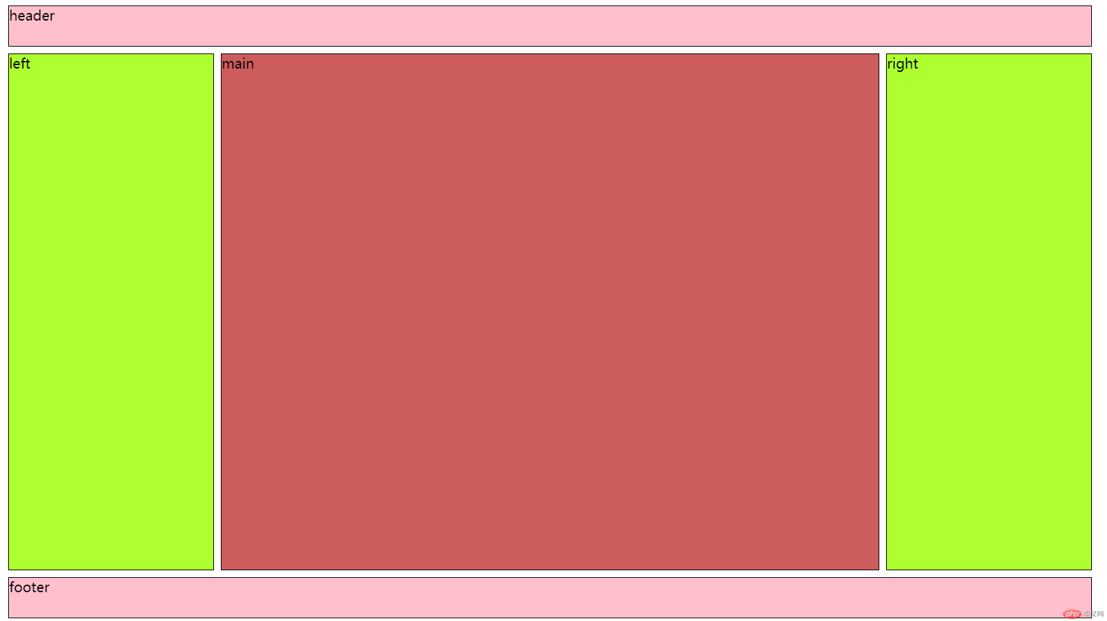
利用grid网格布局快速实现圣杯布局
<!DOCTYPE html><html lang="zh-CN"><head><meta charset="UTF-8" /><meta http-equiv="X-UA-Compatible" content="IE=edge" /><meta name="viewport" content="width=device-width, initial-scale=1.0" /><title>圣杯布局</title><style>body * {border: 1px solid #000;}body {display: grid;grid-template-columns: 15em 50vw 15em;grid-template-rows: 3em 80vh 3em;place-content: center;gap: 0.5em;}header,footer {grid-area: span 1 / span 3;}main {grid-area: 2 /2;}</style></head><body><header>header</header><!-- 圣杯布局要求主体优先渲染 --><main>在CSS布局中有一种经典的布局是圣杯布局</main><aside class="left">left</aside><aside class="right">right</aside><footer>footer</footer></body></html>
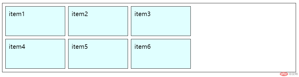
<!DOCTYPE html><html lang="zh-CN"><head><meta charset="UTF-8" /><meta http-equiv="X-UA-Compatible" content="IE=edge" /><meta name="viewport" content="width=device-width, initial-scale=1.0" /><title>常用术语</title><style>/* 1. 网格容器: display:grid*//* 2. 网格项目:容器的子元素 *//* 3. 网格单元: 有单元格和网格区域二种表现形式 *//* 4. 网格轨道: 有行轨与列轨之分 *//* 5. 轨道间距: 轨道间隙,根据轨道类型有: 行轨间隙,列轨间隙 *//* flex: 一维布局技术grid: 二维布局技术 */.container {/* 转为网格容器进行布局 */display: grid;border: 1px solid #000;padding: 0.5em;/* 3列,共6个项目 *//* 1. 设置轨道的列宽 */grid-template-columns: 10em 10em 10em;/* grid-template-columns: auto auto auto; *//* 2. 设置田轨道的行高 *//* 2行, 共6个元素,第一行有3列 */grid-template-rows: 5em 5em;/* 3. 设置轨道间的间隙 *//* gap: 水平 垂直 *//* gap: 0.5em 1em; *//* gap: 0.5em 0.5em; */gap: 0.5em;}.container > .item {/* 父级为grid容器,它内部的子元素自动成为grid项目 */background-color: lightcyan;border: 1px solid #000;padding: 0.5em;}</style></head><body><div class="container"><div class="item">item1</div><div class="item">item2</div><div class="item">item3</div><div class="item">item4</div><div class="item">item5</div><div class="item">item6</div></div></body></html>
更多相关文章
- 210324 CSS flex 布局
- css之flex项目属性与商城首页布局实战
- 移动商城首页的页眉和页脚的布局和flex项目三个属性
- 高性能图表控件LightningChart中有关用分段布局重叠图
- 传统定位布三行三列和flex布局
- flex项目上的三个属性
- flex布局理解
- css-flex布局
- 【CSS入门】前端布局神器Flex弹性盒模型详解及适用场景(建议收藏