flex布局理解
16lz
2021-03-26
flex布局 多行
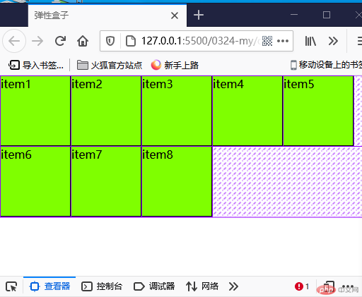
<!DOCTYPE html><html lang="zh-CN"><head><meta charset="UTF-8" /><meta http-equiv="X-UA-Compatible" content="IE=edge" /><meta name="viewport" content="width=device-width, initial-scale=1.0" /><title>弹性盒子</title><style>* {margin: 0;padding: 0;box-sizing: border-box;}html {font-size: 10px;}body {font-size: 1.6rem;}.container {display: flex;height: 20rem;/* width: 5em; */boreder: 1px solid black;}.container > .item {width: 10rem;background-color: chartreuse;border: 1px solid black;}/* 默认 */.container {flex-flow: row wrap;}/* .container {flex-flow: row wrap;} */</style></head><body><div class="container"><item class="item">item1</item><item class="item">item2</item><item class="item">item3</item><item class="item">item4</item><item class="item">item5</item><item class="item">item6</item><item class="item">item7</item><item class="item">item8</item></div></body></html>
列布局
<!DOCTYPE html><html lang="zh-CN"><head><meta charset="UTF-8" /><meta http-equiv="X-UA-Compatible" content="IE=edge" /><meta name="viewport" content="width=device-width, initial-scale=1.0" /><title>弹性盒子</title><style>* {margin: 0;padding: 0;box-sizing: border-box;}html {font-size: 10px;}body {font-size: 1.6rem;}.container {display: flex;height: 20rem;/* width: 5em; */boreder: 1px solid black;}.container > .item {width: 10rem;height: 5rem;background-color: chartreuse;border: 1px solid black;}/* 默认 */.container {flex-flow: column wrap;}/* .container {flex-flow: row wrap;} */</style></head><body><div class="container"><item class="item">item1</item><item class="item">item2</item><item class="item">item3</item><item class="item">item4</item><item class="item">item5</item><item class="item">item6</item><item class="item">item7</item><item class="item">item8</item></div></body></html>
手机页面
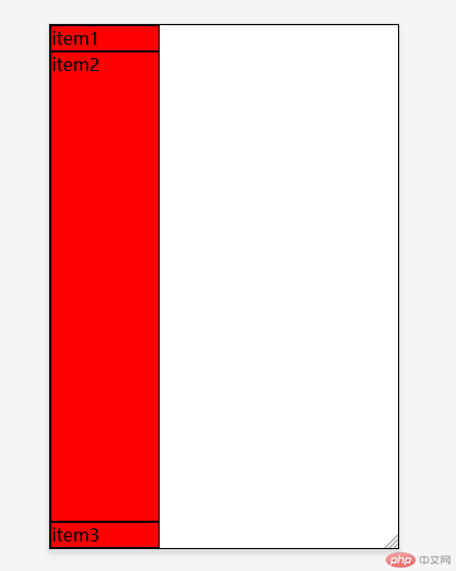
<!DOCTYPE html><html lang="zh-CN"><head><meta charset="UTF-8" /><meta http-equiv="X-UA-Compatible" content="IE=edge" /><meta name="viewport" content="width=device-width, initial-scale=1.0" /><title>手机页面布局</title></head><style>* {margin: 0;padding: 0;box-sizing: border-box;}html {font-size: 10px;}body {font-size: 1.6rem;}.container {display: flex;height: 100vh;border: 1px solid #000;flex-flow: column nowrap;}.container > .item {height: 5rem;width: 10rem;border: 1px solid #000;background-color: red;}.container > .item:nth-of-type(1),.container > .item:nth-of-type(3) {height: 5vh;}.container > .item:nth-of-type(2) {height: 90vh;}</style><body><div class="container"><div class="item">item1</div><div class="item">item2</div><div class="item">item3</div></div></body></html>
项目对齐方式
1.整体居中对齐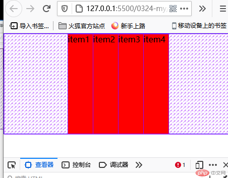
2.整体末尾对齐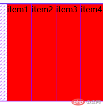
<!DOCTYPE html><html lang="zh-CN"><head><meta charset="UTF-8" /><meta http-equiv="X-UA-Compatible" content="IE=edge" /><meta name="viewport" content="width=device-width, initial-scale=1.0" /><title>flex容器属性</title><style>* {margin: 0;padding: 0;box-sizing: border-box;}:root {font-size: 10px;}body {font-size: 1.6rem;}.container {display: flex;height: 20rem;border: 1px solid blue;justify-content: end;/* justify-content: center; */}.container .item {width: 5rem;background-color: red;}</style></head><body><div class="container"><div class="item">item1</div><div class="item">item2</div><div class="item">item3</div><div class="item">item4</div></div></body></html>
交叉轴对齐方式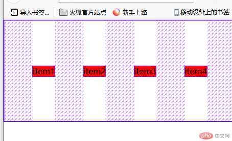
<!DOCTYPE html><html lang="zh-CN"><head><meta charset="UTF-8" /><meta http-equiv="X-UA-Compatible" content="IE=edge" /><meta name="viewport" content="width=device-width, initial-scale=1.0" /><title>flex容器属性</title><style>* {margin: 0;padding: 0;box-sizing: border-box;}:root {font-size: 10px;}body {font-size: 1.6rem;}.container {display: flex;height: 20rem;border: 1px solid blue;justify-content: space-evenly;/* justify-content: end; *//* justify-content: center; */align-items: center;}.container .item {/* width: 5rem; */background-color: red;}</style></head><body><div class="container"><div class="item">item1</div><div class="item">item2</div><div class="item">item3</div><div class="item">item4</div></div></body></html>3.多行文本布局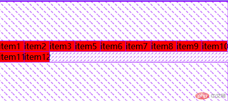```html<!DOCTYPE html><html lang="zh-CN"><head><meta charset="UTF-8" /><meta http-equiv="X-UA-Compatible" content="IE=edge" /><meta name="viewport" content="width=device-width, initial-scale=1.0" /><title>flex容器属性</title><style>* {margin: 0;padding: 0;box-sizing: border-box;}:root {font-size: 10px;}body {font-size: 1.6rem;}.container {display: flex;flex-flow: row wrap;height: 20rem;border: 1px solid blue;/* justify-content: space-evenly; *//* justify-content: end; *//* justify-content: center; *//* align-items: center; */align-content: flex-end;align-content: flex-start;align-content: center;}.container .item {/* height: 3rem; */width: 5rem;background-color: red;}</style></head><body><div class="container"><div class="item">item1</div><div class="item">item2</div><div class="item">item3</div><div class="item">item5</div><div class="item">item6</div><div class="item">item7</div><div class="item">item8</div><div class="item">item9</div><div class="item">item10</div><div class="item">item11</div><div class="item">item12</div></div></body></html>
更多相关文章
- flex容器中的四个属性的功能演示
- flex容器属性的功能,参数,以及作用
- css-flex布局
- 3.24实例演示flex容器中的四个属性的功能,参数,以及作用
- css之flex容器
- 【CSS入门】前端布局神器Flex弹性盒模型详解及适用场景(建议收藏
- 0324作业-flex布局
- flex布局:flex容器中的四个属性的功能,参数,以及作用
- 在苹果Mac上的“邮件”中如何使用列布局?