flex容器与项目的常用属性
16lz
2021-02-23
定位布局的常用思路 代码
<!DOCTYPE html><html lang="zh-CN"><head><meta charset="UTF-8"><meta name="viewport" content="width=device-width, initial-scale=1.0"><title>定位布局的常用思路</title><style>/* 初始化 */* {margin: 0;padding: 0;box-sizing: border-box;}/* 页眉页脚 */header,footer {height: 3em;background-color: lightgreen;}/* 主体部分采用绝对定位 */.container {/* 定位元素 */position: relative;min-height: 40em;margin: 0.5em 0;}.container aside {width: 15em;background-color: lightskyblue;min-height: inherit;}/* 左中右全部进行绝对定位 */.container aside:first-of-type{position: absolute;top: 0;left: 0;}.container aside:last-of-type{position: absolute;top: 0;right: 0;}.container main{min-height: inherit;position: absolute;background-color: yellow;/* padding: 0 15em; */left: 15.5em;right: 15.5em;}</style></head><body><header>页眉</header><div class="container"><aside>左侧</aside><main>内容区</main><aside>右侧</aside></div><footer>页脚</footer></body></html>
效果: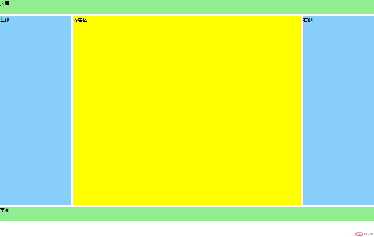
flex快速实现水平和垂直居中 代码
<!DOCTYPE html><html lang="zh-CN"><head><meta charset="UTF-8"><meta name="viewport" content="width=device-width, initial-scale=1.0"><title>flex快速实现水平和垂直居中</title><style>.box {width: 15em;height: 15em;background-color: lightseagreen;/* position: relative; */}.box .item {width: 5em;height: 5em;background-color: coral;}/* .box .item {position: absolute;top: 0;left: 0;right: 0;bottom: 0;margin: auto;} */.box {display: flex;justify-content: center;align-items: center;}</style></head><body><div class="box"><div class="item"></div></div></body></html>
效果: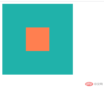
flex实现常用的三列布局 代码
<!DOCTYPE html><html lang="zh-CN"><head><meta charset="UTF-8"><meta name="viewport" content="width=device-width, initial-scale=1.0"><title>flex实现常用的三列布局</title><style>/* 从body的所有后代匹配的元素中,去掉某些元素 */body *:not(.container) {background-color: lightseagreen;}header,footer {height: 8vh;}.container {display: flex;margin: 0.5em 0;height: calc(84vh - 2em);}.container aside {min-width: 15em;}.container main {min-width: calc(100% - 30em - 1em);margin: 0 0.5em;}</style></head><body><header>页眉</header><div class="container"><aside>左侧</aside><main>内容区</main><aside>右侧</aside></div><footer>页脚</footer></body></html>
效果: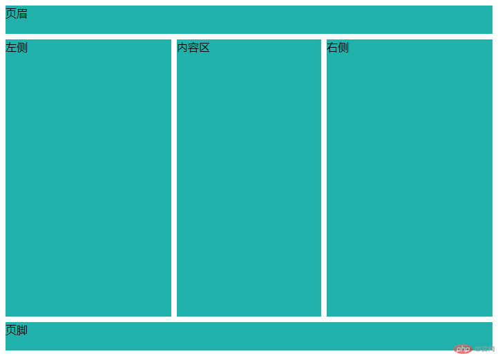
grid实现常用的三列布局 代码
<!DOCTYPE html><html lang="zh-CN"><head><meta charset="UTF-8"><meta name="viewport" content="width=device-width, initial-scale=1.0"><title>grid实现常用的三列布局</title><style>body {height: calc(100vh - 1em);display: grid;grid-template-columns: 15em 1fr 15em;grid-template-rows: 8vh 1fr 8vh;gap: 0.5em;}header, footer {grid-column: span 3;}body>*{background-color: lightseagreen;}/* grid 虽然强大无比,但不代表到处都要用到它,它更适合整体/宏观布局,而flex适合细节处理 */</style></head><body><header>页眉</header><aside>左侧</aside><main>内容区</main><aside>右侧</aside><footer>页脚</footer></body></html>
效果: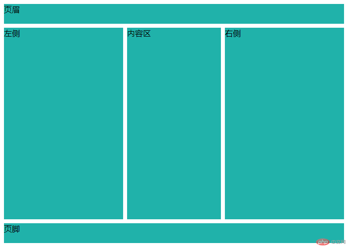
弹性容器与弹性项目 代码
<!DOCTYPE html><html lang="zh-CN"><head><meta charset="UTF-8"><meta name="viewport" content="width=device-width, initial-scale=1.0"><title>弹性容器与弹性项目</title><style>* {box-sizing: border-box;}.container {/* 转为flex弹性布局元素 */display: flex;height: 15em;border: 1px solid black;padding: 1em;margin: 1em;}.container>.item {height: 2em;width: 5em;background-color: lightcyan;border: 1px solid black;}/* 1.任何元素都可以通过添加display: flex属性,转为弹性盒元素2.转为flex元素后,它的内部的“子元素”就支持flex布局了3.使用了display: flex属性的元素称为: flex容器4.flex 容器中的“子元素”称为: flex项目5.容器中的项目自动转为“行内块元素”(不管之前是什么类型) */.container>.item:nth-child(4) {display: flex;}.container>.item:nth-child(4)>div{background-color: yellow;}/* 工作中会存在大量的flex容器的嵌套布局 */</style></head><body><div class="container"><div class="item">item1</div><div class="item">item2</div><div class="item">item3</div><div class="item">item4<div>1</div><div>2</div><div>3</div></div></div></body></html>
效果: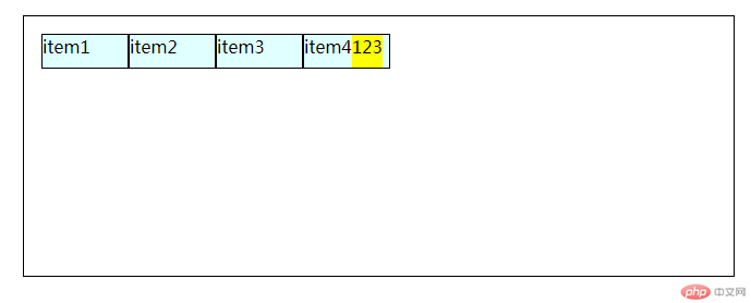
弹性项目在主轴上的排列方式 代码
<!DOCTYPE html><html lang="zh-CN"><head><meta charset="UTF-8"><meta name="viewport" content="width=device-width, initial-scale=1.0"><title>弹性项目在主轴上的排列方式</title><style>* {box-sizing: border-box;}.container {/* 转为flex弹性布局元素 */display: flex;height: 15em;border: 1px solid black;padding: 1em;margin: 1em;}.container>.item {width: 5em;height: 5em;background-color: lightcyan;border: 1px solid black;}/* 1.单行容器 */.container {/* flex-direction: row;flex-wrap: nowrap; */flex-flow: row nowrap;}/* 2.多行容器:一行显示不下,允许换行显示 */.container {flex-flow: row wrap;}.container {flex-flow: column nowrap;flex-flow: column wrap;}</style></head><body><div class="container"><div class="item">item1</div><div class="item">item2</div><div class="item">item3</div><div class="item">item4</div><div class="item">item5</div><div class="item">item6</div><div class="item">item7</div><div class="item">item8</div></div></body></html>
效果: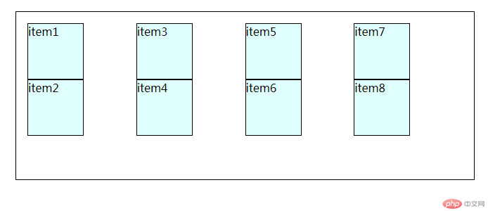
弹性项目在单行上的对齐方式 代码
<!DOCTYPE html><html lang="zh-CN"><head><meta charset="UTF-8"><meta name="viewport" content="width=device-width, initial-scale=1.0"><title>弹性项目在单行上的对齐方式</title><style>* {box-sizing: border-box;}.container {/* 转为flex弹性布局元素 */display: flex;height: 15em;border: 1px solid black;padding: 1em;margin: 1em;}.container>.item {width: 5em;/* height: 5em; */background-color: lightcyan;border: 1px solid black;}/* 设置项目在单行容器主轴上的对齐前提:主轴上存在剩余空间 */.container {/* flex-flow: row nowrap; *//* 空间分配二种方案: *//* 1.将所有项目视为一个整体,在项目组二边进行分配 */justify-content: flex-start;justify-content: flex-end;justify-content: center;/* 2.将项目视为一个个独立的个体,在项目之间进行分配 *//* 二端对齐 */justify-content: space-between;/* 分散对齐 */justify-content: space-around;/* 平均对齐 */justify-content: space-evenly;}/* 交叉轴上的对齐方式 */.container {/* 默认拉伸 */align-items: stretch;align-items: flex-start;align-items: flex-end;align-items: center;}</style></head><body><div class="container"><div class="item">item1</div><div class="item">item2</div><div class="item">item3</div><div class="item">item4</div></div></body></html>
效果: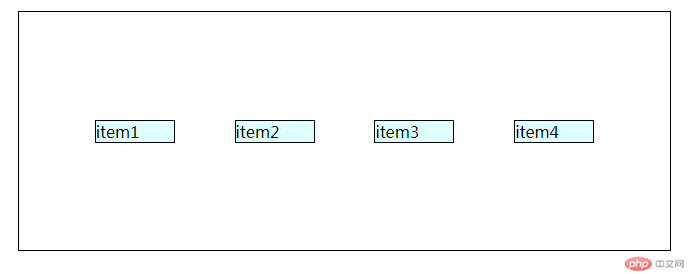
弹性项目在多行上的对齐方式 代码
<!DOCTYPE html><html lang="zh-CN"><head><meta charset="UTF-8"><meta name="viewport" content="width=device-width, initial-scale=1.0"><title>弹性项目在多行上的对齐方式</title><style>* {box-sizing: border-box;}.container {/* 转为flex弹性布局元素 */display: flex;height: 15em;border: 1px solid black;padding: 1em;margin: 1em;}.container>.item {width: 5em;/* height: 5em; */background-color: lightcyan;border: 1px solid black;}.container {flex-flow: row wrap;align-content: stretch;align-content: flex-start;align-content: flex-end;align-content: center;align-content: space-between;align-content: space-around;align-content: space-evenly;}/* 容器属性:flex-flow: 主轴方向与换行justify-content: 项目在主轴上的对齐方式align-items:项目在交叉轴上的对齐方式align-content: 项目在多行容器中的交叉轴上的对齐方式 */</style></head><body><div class="container"><div class="item">item1</div><div class="item">item2</div><div class="item">item3</div><div class="item">item4</div><div class="item">item5</div><div class="item">item6</div><div class="item">item7</div><div class="item">item8</div><div class="item">item9</div><div class="item">item10</div><div class="item">item11</div><div class="item">item12</div></div></body></html>
效果: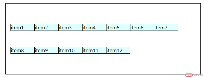
项目上的属性: flex 代码
<!DOCTYPE html><html lang="zh-CN"><head><meta charset="UTF-8"><meta name="viewport" content="width=device-width, initial-scale=1.0"><title>项目上的属性: flex</title><style>* {box-sizing: border-box;}.container {/* 转为flex弹性布局元素 */display: flex;height: 15em;border: 1px solid black;padding: 1em;margin: 1em;}.container>.item {width: 5em;/* height: 5em; */background-color: lightcyan;border: 1px solid black;}/* 项目属性flex */.container .item {/* flex: flex-grow flex-shrink flex-basis *//* flex: 放大因子 收缩因子 项目在主轴上的基准宽度 */flex: 0 1 auto;flex: initial;/* 允许放大和收缩 */flex: 1 1 auto;flex: auto;/* 禁止放大和收缩 */flex: 0 0 auto;flex: none;/* 如果只有一个数字,省掉后面二个参数,表示的放大因子 */flex: 1;/* 等于 flex: 1 1 auto; */flex: 2;flex: 3;/* flex 通常不会用来设置所有项目的默认选项,通常用来设置某一个项目的特征 */}/* 写一个案例,要求第2个 和 第3个项目的宽度是第1个和第4个2倍 */.container>.item:first-of-type,.container>.item:last-of-type {flex: 1;}.container>.item:nth-of-type(2),.container>.item:nth-of-type(2)+* {flex: 2;}</style></head><body><div class="container"><div class="item">item1</div><div class="item">item2</div><div class="item">item3</div><div class="item">item4</div></div></body></html>
效果: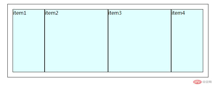
设置某一个项目在交叉轴上的对齐方式 代码
<!DOCTYPE html><html lang="zh-CN"><head><meta charset="UTF-8"><meta name="viewport" content="width=device-width, initial-scale=1.0"><title>设置某一个项目在交叉轴上的对齐方式</title><style>* {box-sizing: border-box;}.container {/* 转为flex弹性布局元素 */display: flex;height: 15em;border: 1px solid black;padding: 1em;margin: 1em;position: relative;}.container>.item {width: 5em;/* height: 5em; */background-color: lightcyan;border: 1px solid black;}/* 例如设置第2个项目与其它项目的对齐方式不一样 */.container>.item:nth-of-type(2){align-self: stretch;align-self: flex-start;align-self: flex-end;align-self: center;/* position: relative; */position: absolute;left: -2em;top: 3em;}</style></head><body><div class="container"><div class="item">item1</div><div class="item">item2</div><div class="item">item3</div><div class="item">item4</div></div></body></html>
效果: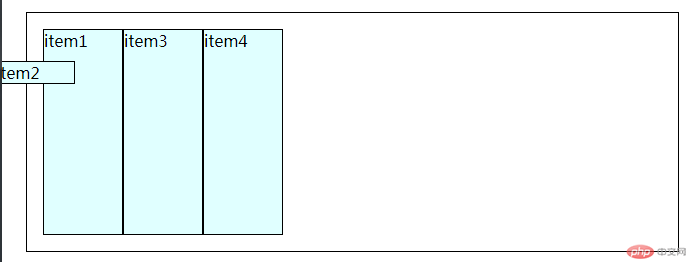
设置项目在主轴上的显示顺序 代码
<!DOCTYPE html><html lang="zh-CN"><head><meta charset="UTF-8"><meta name="viewport" content="width=device-width, initial-scale=1.0"><title>设置项目在主轴上的显示顺序</title><style>* {box-sizing: border-box;}.container {/* 转为flex弹性布局元素 */display: flex;height: 15em;border: 1px solid black;padding: 1em;margin: 1em;position: relative;}.container>.item {width: 5em;/* height: 5em; */background-color: lightcyan;border: 1px solid black;}/* 显示顺序:默认按书写的源码顺序排列 *//* 默认序号越小越靠前,越大越靠后 */.container>.item:first-of-type {order: 1;order: 5;background-color: violet;}.container>.item:nth-of-type(2) {order: 2;background-color:turquoise;}.container>.item:nth-of-type(3) {order: 3;order: 0;background-color: royalblue;}.container>.item:nth-of-type(4) {order: 4;/* 支持负值 */order: -1;background-color: green;}/* 项目常用属性:flex: 设置基本项目的伸缩与宽度align-self: 某个项目的对齐方式order: 设置某个项目在主轴上的排列顺序 */</style></head><body><div class="container"><div class="item">item1</div><div class="item">item2</div><div class="item">item3</div><div class="item">item4</div></div></body></html>
效果: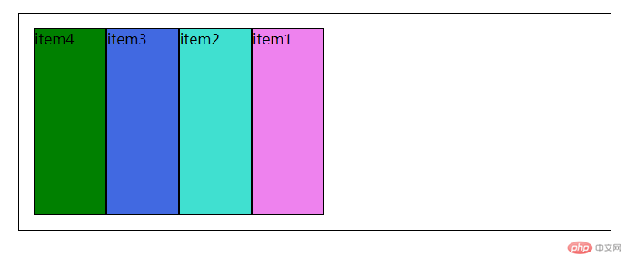
总结:
定位布局的常用思路:
- 页眉,主体(左侧,内容区,右侧),页脚
弹性盒元素:
- 通过添加display: flex属性来转换 (子元素自动转为“行内块元素”)
flex容器:
- 使用了display: flex属性的元素 (flex容器可以嵌套)
flex项目:
- flex 容器中的“子元素”
容器属性:
- flex-flow: 主轴方向与换行
- justify-content: 项目在主轴上的对齐方式
- align-items:项目在交叉轴上的对齐方式
- align-content: 项目在多行容器中的交叉轴上的对齐方式
单行容器:
- flex-flow: row nowrap;
多行容器:
- 一行显示不下,允许换行显示 flex-flow(row wrap 或 column wrap)
单行容器主轴上的对齐: justify-content (设置项目在单行容器主轴上的对齐前提:主轴上存在剩余空间)
- 1.将所有项目视为一个整体,在项目组二边进行分配 (flex-start, flex-end, center)
- 2.将项目视为一个个独立的个体,在项目之间进行分配 (space-between, space-around, space-evenly)
交叉轴上的对齐方式: align-items
- ( stretch, flex-start, flex-end, center )
项目常用属性:
- flex: 设置基本项目的伸缩与宽度
- align-self: 某个项目的对齐方式
- order: 设置某个项目在主轴上的排列顺序
flex属性: flex-grow(放大因子) flex-shrink(收缩因子) flex-basis(项目在主轴上的基准宽度)
- 默认:flex: 0 1 auto; flex: initial;
- 允许放大和收缩:flex: 1 1 auto; flex: auto;
- 禁止放大和收缩: flex: 0 0 auto; flex: none;
- 如果只有一个数字,省掉后面二个参数,表示的放大因子:flex: 1;等于 flex: 1 1 auto;
设置某一个项目在交叉轴上的对齐方式: align-self
- ( stretch, flex-start, flex-end, center )
设置项目在主轴上的显示顺序: order
- 1.显示顺序:默认按书写的源码顺序排列
- 2.序号越小越靠前,越大越靠后
- 3.支持负值
更多相关文章
- 【硬核干货】如何高效找到优质编程项目?
- 【每日一练】PMP项目管理专业资格认证考试练习题(五十二)
- grid项目对齐示例并用grid模拟bootstrap/layui的12列栅格布局组
- 实战项目:用原生JS实现一个购物车的功能
- 程序员入门之路
- React16.8+Next.js+Koa2开发Github全栈项目
- Laravel重构企业级电商项目 全面强化职场核心竞争力
- Go微服务入门到容器化实践,落地可观测的微服务电商项目【完结】
- 毕设一课通 从开题到答辩高效完成(含全栈项目)