模态框实例
16lz
2022-03-25
模态框实例
HTML代码如下:
<!DOCTYPE html><html lang="en"><head><meta charset="UTF-8"><meta http-equiv="X-UA-Compatible" content="IE=edge"><meta name="viewport" content="width=device-width, initial-scale=1.0"><title>模态框</title><link rel="stylesheet" href="modal.css"><script src="modal.js"></script></head><body><header><h2 class="title">上草一方的博客</h2><button onclick="showModal()">登录</button></header><!-- 模态框 --><div class="modal"><!-- 1.半透明的遮罩 --><div class="modal-bg" onclick="closeModal()"></div><!-- 2.弹层表单 --><form action="" class="modal-form"><fieldset style="display: grid;gap: 1em;"><legend>用户登录</legend><input type="email" name="email" placeholder="user@email.com"><input type="password" name="pwd" placeholder="不少于8位"><button>登录</button></fieldset></form></div></body></html>
CSS代码如下:
/* 初始化 */* {margin: 0;padding: 0;box-sizing: border-box;}/* 头部样式 */header {background-color: lightseagreen;padding: 0.5em 1em;display: flex;}header .title{font-weight: lighter;font-style: italic;color: white;letter-spacing: 2px;text-shadow: 1px 1px 1px #555;}/* 登录按钮 */header button{margin-left: auto;width: 5em;border: none;border-radius: 0.5em;}header button:hover{cursor: pointer;background-color:hotpink;color: #fff;box-shadow: 2px 2px 4px white;transition: 0.3s;}/* 模态框 */.modal .modal-form fieldset{height: 17.5em;background-color: lightcyan;border: none;padding: 2em 3em;box-shadow: 0 0 5px #888;}.modal .modal-form fieldset legend{padding: 7px 1.5em;background-color:aqua;color: #fff;border-radius: 5px;}.modal .modal-form fieldset input{height: 2.5em;padding-left: 1em;border: 1px solid #ddd;outline: none;font-size: 14px;}.modal .modal-form fieldset input:focus{box-shadow: 2px 2px 8px #888;border: none;}.modal .modal-form fieldset button{background-color: lightseagreen;color: #fff;border: none;height: 3em;font-size: 16px;height: 2.5em;border-radius: 5px;}.modal .modal-form fieldset button:hover{background-color: hotpink;cursor: pointer;box-shadow: 2px 2px 8px gray;}/* 定位 */.modal .modal-form{position: fixed;top: 10em;left: 30em;right: 30em;}/* 遮罩 */.modal .modal-bg{position: fixed;/* 坐标全部清零,请定位到四个顶点 */top: 0;left: 0;right: 0;bottom: 0;background-color:rgba(0,0,0,0.5);}.modal{display: none;}
运行效果图如下: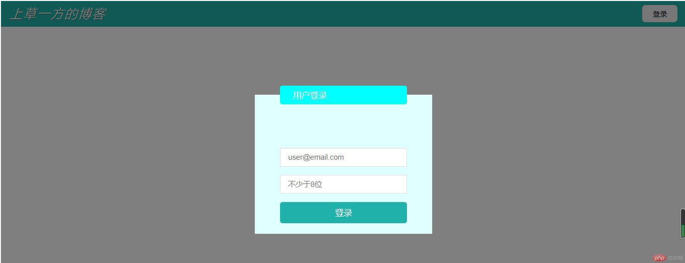
更多相关文章
- ListView有背景图片或背景颜色,那么在滑动ListView的时候,ListView
- Android(安卓)高手进阶教程(十三)之----Android(安卓)数据库SQLi
- MacOS下PHP7.1升级到PHP7.4.15的方法
- Android中几种图像特效处理的集锦!!
- Android(安卓)显示系统键盘搜索按键,实现搜索功能
- Android中几种图像特效处理的集锦
- Android高手进阶教程(二)之----Android(安卓)Launcher抽屉类Slid
- Android(安卓)Service详解(三) AIDL使用解析
- android 学习总结