媒体查询、固定定位实战、flex 常用属性小结
16lz
2022-01-23
媒体查询、固定定位实战、flex 常用属性
一、媒体查询
- 媒体查询, 布局 PC 优先, 从大屏开始适配
<!DOCTYPE html><html lang="en"><head><meta charset="UTF-8" /><meta http-equiv="X-UA-Compatible" content="IE=edge" /><meta name="viewport" content="width=device-width, initial-scale=1.0" /><title>媒体查询</title></head><body><button class="div1">字体大小变化1</button><button class="div2">字体大小变化2</button><button class="div3">字体大小变化3</button><style>html {/* 设置1rem=10px */font-size: 10px;}div {text-align: center;padding: 0.5rem;background-color: aqua;margin: 1rem;}.div1 {width: 9.6rem;font-size: 1.2rem;}.div2 {width: 12.8rem;font-size: 1.6rem;}.div3 {width: 16rem;font-size: 2rem;}/* PC优先,从最大屏幕开始 *//* 动态修改字号rem,可实现动态变化大小 *//* 屏幕 > 992 */@media (min-width: 992px) {html {font-size: 20px;}}/* 991 > 屏幕 > 720 */@media (max-width: 991px) and (min-width: 720) {html {font-size: 16px;}}/* 719 > 屏幕 > 540 */@media (min-width: 540px) and (max-width: 719px) {html {font-size: 12px;}}/* 屏幕 < 539 */@media (max-width: 539px) {html {font-size: 10px;}}</style></body></html>
二、固定定位做登录页面
1. 复习定位
- 文档流:页面中元素显示的顺序与文件中书写顺序一致。
- 静态定位: position: static; 为默认的定位。
- 相对定位: position: relative;
特点:元素仍然在文档流中,所占的空间仍存在,只是相对原空间发生位置偏移。
- 绝对定位: position: absolute;
特点:
(1)元素不再相对于自身原空间,而是相对于包含该元素的父级块。
(2)充当绝对定位父级块的元素必须是定位元素,即只要设置为不是 static 就可以了。
(3)如果绝对元素找不到父级定位元素,则会一直向上找,找不到就相对于 body 元素。
(4)脱离文档流,即让出所占用的空间给后面的元素。
- 固定定位: position: fixed;
特点:是绝对定位的子集,只不过其包含元素是固定的,永远是 body
2. 实例
<!DOCTYPE html><html lang="en"><head><meta charset="UTF-8" /><meta http-equiv="X-UA-Compatible" content="IE=edge" /><meta name="viewport" content="width=device-width, initial-scale=1.0" /><title>固定定位做登录页面</title></head><body><div class="header"><div class="logo">宇宙编程大课堂</div><button class="logo_btn">登录</button></div><div class="zhezhao"></div><form action="" class="lgoin"><input type="text" name="" placeholder="输入用户名" /><input type="password" name="" placeholder="输入密码" /><button class="form_btn">登录</button></form><style>* {margin: 0;padding: 0;box-sizing: border-box;}html {font-size: 10px;}.header {display: flex;justify-content: space-between;padding: 1em 1.2em;background-color: lightseagreen;}.logo {height: 1.5em;font-size: 2.3em;color: white;text-shadow: 1px 1px 1px #555;}.logo_btn {display: inline-block;padding: 0.1em 1em;}.zhezhao {position: fixed;top: 0;bottom: 0;left: 0;right: 0;background-color: rgb(0, 0, 0, 0.3);}form {min-width: 25em;background-color: white;border: 1px solid rgb(62, 62, 66);position: fixed;top: 20em;left: 20em;right: 20em;}input {display: block;text-align: center;width: 15em;margin: 1em auto;}.form_btn {display: block;margin: 1em auto;padding: 0.3rem 3rem;}.form_btn:hover {cursor: pointer;background-color: goldenrod;}</style></body></html>
运行效果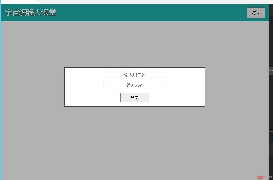
三、flex 常用属性
1. 设置 flex 容器
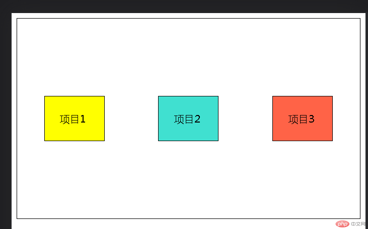
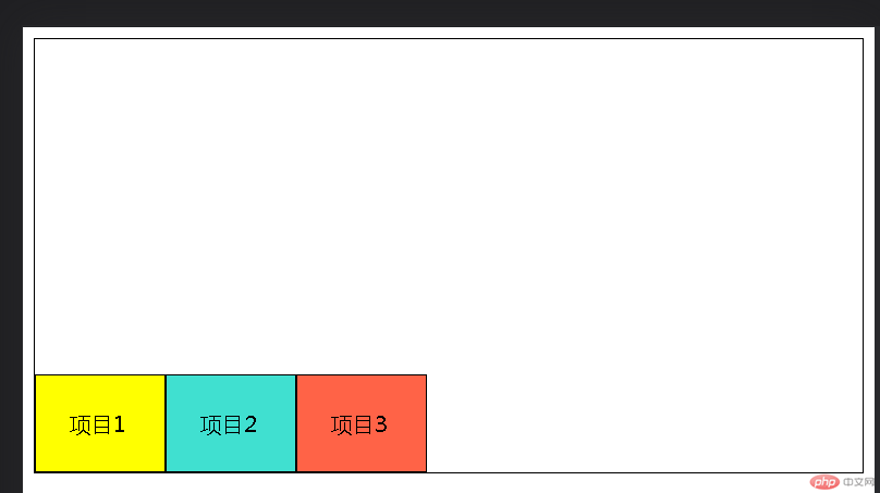
<div class="flex_box"><div class="flex_box_son">项目1</div><div class="flex_box_son">项目2</div><div class="flex_box_son">项目3</div></div><style>div {box-sizing: border-box;border: 1px solid #000;}/* 1. 设置flex容器 *//* 默认按主轴排列,从左到右 */.flex_box {height: 20em;display: flex;}.flex_box_son {width: 6em;/* height: 5em; */padding: 1.5em;background-color: turquoise;}.flex_box_son:first-of-type {background-color: yellow;}.flex_box_son:last-of-type {background-color: tomato;}
默认效果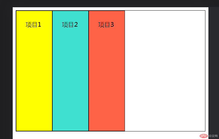
2. 在容器中使用的属性
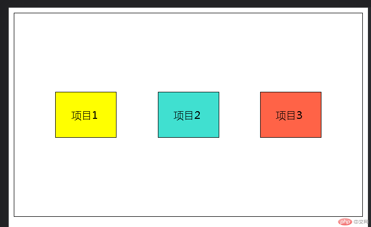
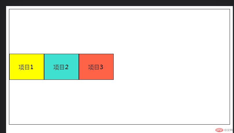
/* 2. 在容器中使用的属性 *//* (1)设置容器主轴方向,满行时是否换行 */.flex_box {/* 主轴横向,换行 */flex-flow: row wrap;}
运行效果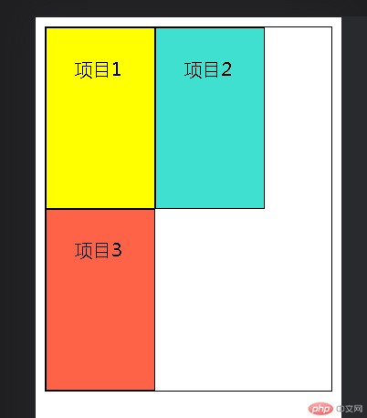
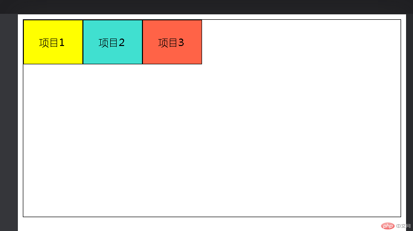
/* (2)在项目之间分配容器剩余空间 */.flex_box {/* 两端对齐 */place-content: space-between;/* 分散对齐 */place-content: space-around;/* 平均对齐 */place-content: space-evenly;}
效果分别如下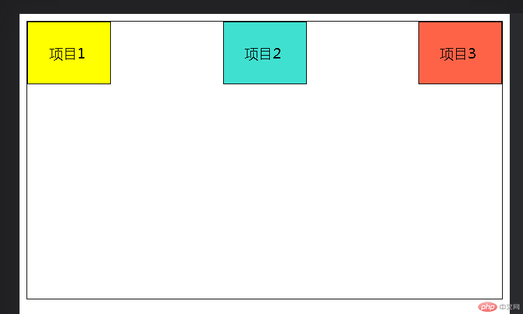
/* (3)在交叉轴上的对齐 *//* 不能设置place-content属性,否则无效 */.flex_box {place-items: stretch;/* 上对齐 */place-items: start;/* 下对齐 */place-items: end;/* 中间对齐 */place-items: center;}
效果分别如下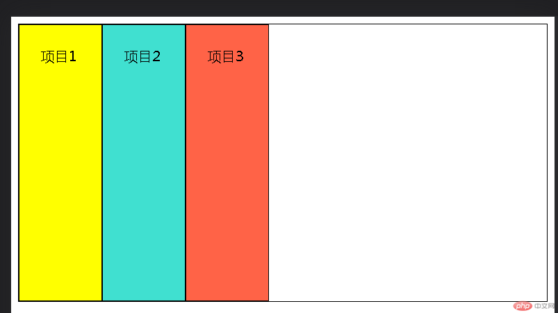
3. 在项目中设置的属性
/* 3. 在项目中设置的属性 *//* (1)flex: 设置放大因子、收缩因子、计算宽度 */.flex_box_son {flex: 0 1 8em;}/* (2)排序 */.flex_box_son:first-of-type {/* 默认为0,比0大排在后,小在前 */order: 1;}.flex_box_son:last-of-type {order: -2;}
效果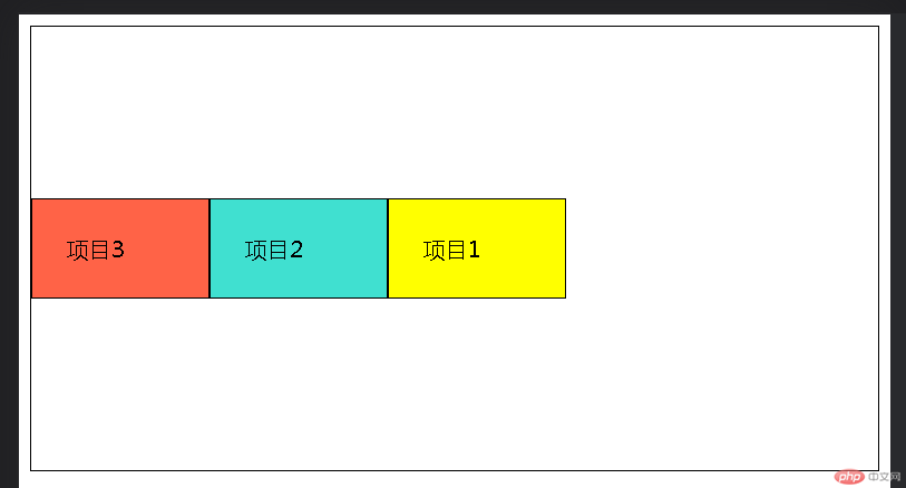
更多相关文章
- 浅谈Android五大布局
- 从零开始学android开发-布局中 layout_gravity、gravity、orient
- android操作XML的几种方式
- 浅谈Android五大布局
- 在Android里完美实现基站和WIFI定位
- Android(安卓)GPS定位的简单应用
- android操作XML的几种方式
- 面试题
- android 三种定位方式