【归纳】赶紧收藏css实现水平垂直居中的八种快速方法总结
16lz
2021-03-31
1. 利用text-align实现行内元素居中
行内元素居中就很简单,只需要设置一下元素的text-align和行高
.box {height: 300px;width: 300px;background-color: pink;margin: 100px auto;}.box p {text-align: center;line-height: 300px;}
2.利用定位再结合margin:auto实现
块元素的水平居中利用margin就可以实现,但垂直居中显然不太好实现。
.box {height: 300px;width: 300px;background-color: pink;margin: 100px auto;position: relative;}.box div {width: 30px;height: 30px;background-color: red;position: absolute;top: 0;bottom: 0;left: 0;right: 0;margin: auto;}
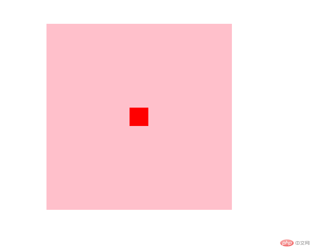
3.已知宽高利用负margin和定位配合
.box {height: 300px;width: 300px;background-color: pink;margin: 100px auto;position: relative;}.box div {width: 30px;height: 30px;background-color: red;position: absolute;left: 50%;top: 50%;margin-left: -15px;margin-top: -15px;}
4. 定位通过计算元素宽高实现居中
<!DOCTYPE html><head><title>absolute+margin计算元素宽高判断居中</title><meta http-equiv="Content-Type" content="text/html; charset=utf-8" /><style>.content {width: 300px;height: 300px;border: 1px solid #109D71;position: relative;}.box {position: absolute;width: 100px;height: 100px;/* top: 50%;left: 50%;margin-top: -50px;margin-left: -50px; */top: calc(50% - 50px);left: calc(50% - 50px);background: #109D71;}</style></head><body><div class="content"><div class="box"></div></div></body></html>
5.通过translate将元素移动自身的50%
translate(-50%,-50%) 属性:向上(x轴)和左(y轴),移动自身长宽的 50%,使其居于中心位置。
top: 50%;left: 50%;:是以窗口左上角为原点,需要减掉自身宽高的一半,才能居中。
与使用margin实现居中不同的是,margin必须知道自身的宽高,而translate可以在不知道宽高的情况下进行居中,tranlate函数中的百分比是相对于自身宽高的百分比。
<!DOCTYPE html><head><title>absolute+translate</title><meta http-equiv="Content-Type" content="text/html; charset=utf-8" /><style>.content {width: 300px;height: 300px;border: 1px solid #109D71;position: relative;}.box {position: absolute;width: 100px;height: 100px;top: 50%;left: 50%;transform: translate(-50%, -50%);background: #109D71;}</style></head><body><div class="content"><div class="box"></div></div></body></html>
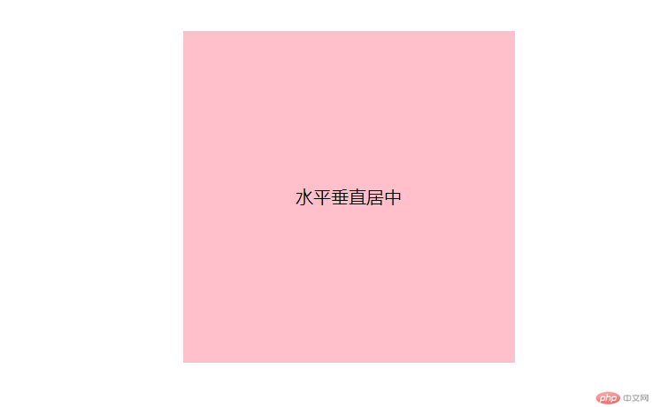
6.flex 弹性布局实现
<!DOCTYPE html><html><head><meta charset="UTF-8"><title>flex布局</title><style>.content {width: 300px;height: 300px;margin: 50px;border: 1px solid #109D71;display: flex;align-items: center;justify-content: center;}.box{width: 150px;height: 150px;background-color: #109D71;text-align: center;margin: 0 auto;display: flex;align-items: center;justify-content: center;}</style></head><body><div class="content"><div class="box">水平垂直居中</div></div></body></html>
7.grid网格布局实现
<!DOCTYPE html><html><head><meta charset="UTF-8"><title>flex布局</title><style>.content {width: 300px;height: 300px;margin: 50px;border: 1px solid #109D71;display: grid;place-items: center;place-content: center;}.box {width: 150px;height: 150px;background-color: #109D71;text-align: center;margin: 0 auto;display: grid;place-items: center;}</style></head><body><div class="content"><div class="box">水平垂直居中</div></div></body></html>
display:table-cell属性来实现" class="reference-link">8.利用display:table-cell属性来实现
display:table-cell;结合vertical-align: middle;使用实现垂直居中,margin:0 atuo;可以实现子元素的水平居中。
<!DOCTYPE html><html><head><meta charset="utf-8"><title>table-cell居中</title><style type="text/css">.content{border: 1px solid blue;display: table;margin: 50px auto;}.table{height: 300px;width: 300px;display: table-cell;vertical-align: middle;border: 1px solid red;}.box{height: 150px;width: 150px;background: #109D71;margin: 0 auto;display: table;}.word{display: table-cell;vertical-align: middle;text-align: center;}</style></head><body><div class="content"><div class="table"><div class="box"><div class="word">垂直水平居中</div></div></div></div></body></html>
更多相关文章
- 0323作业-css基础知识3
- Playwright自动化测试工具之元素定位实战
- 0322作业-CSS基础1
- 堆实战(动态数据流求top k大元素,动态数据流求中位数)
- 0322作业(选择器的优先级,id,class,tag); (前端组件样式模块化的
- 0319作业-常用html元素(下)
- 0319作业-常用html元素(上)
- python+opencv实现连通区域分离
- 前端vue面试题大全